

Jiffi
Solving the problem of everything
Jiffi is a tech consultancy that exists to help businesses find clarity in a techno-enabled world that has become increasingly complex and difficult to navigate. As software, systems and tools continue to multiply, running a business has become harder than it should be, especially when technology is meant to create clarity, not confusion.
Our challenge was to tell that story, and to create a brand that explained a complex concept, simply. We needed to reframe Jiffi’s role from a vague technical helper into a clear problem-solving partner. Through disciplined storytelling, a sharper strategic narrative, and the introduction of a cast of small yellow characters to make things make sense. We built a brand identity that finally made sense of the chaos.
Scope
Strategy, Branding, Copywriting
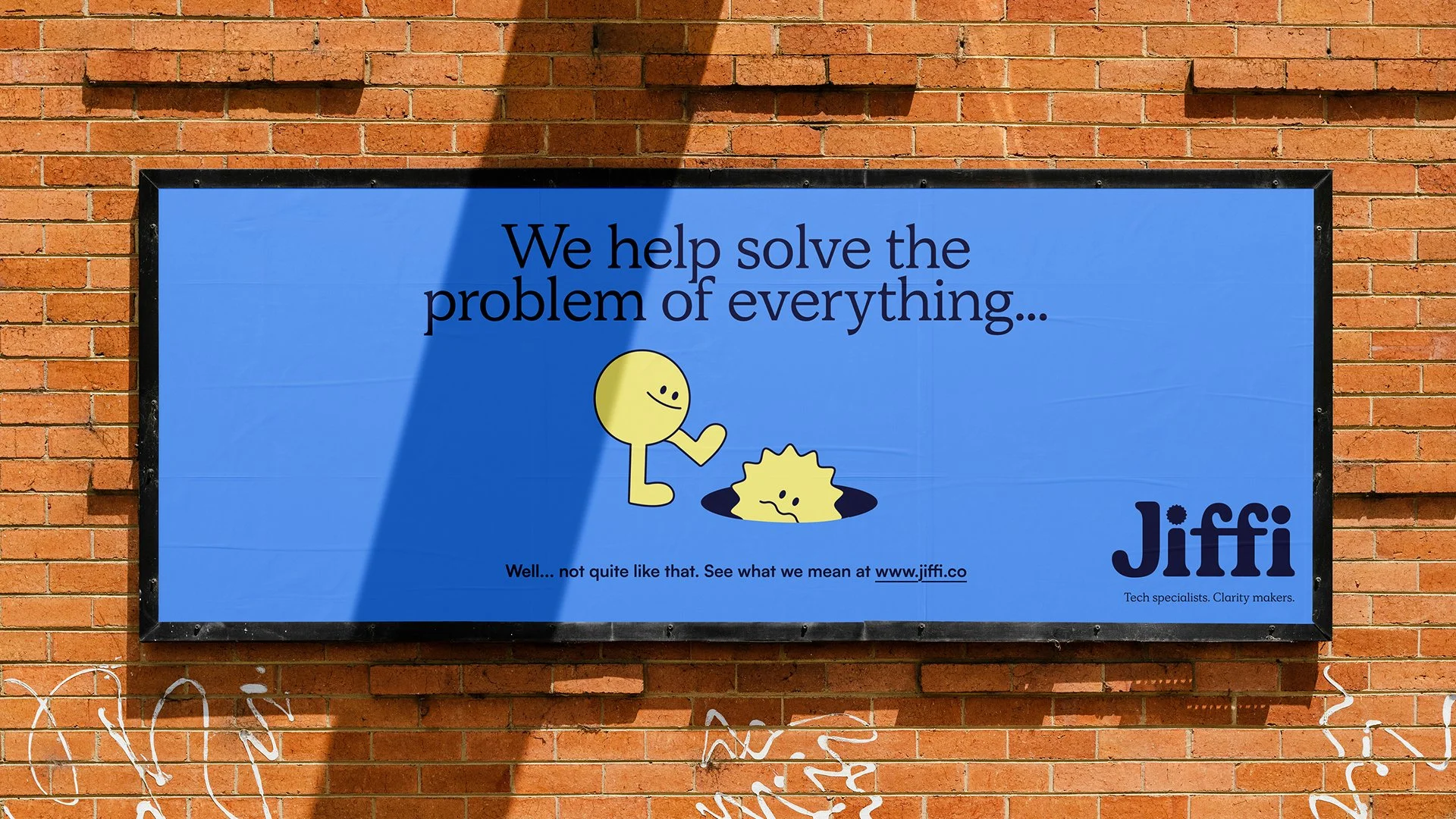
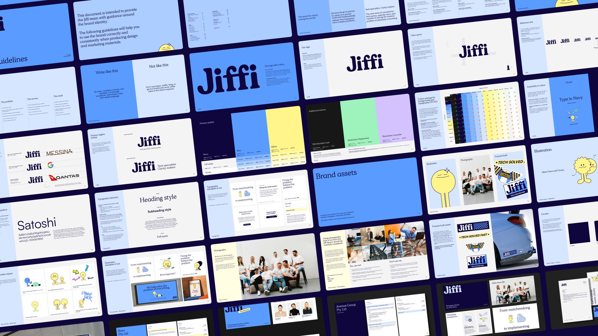
Jiffi exists to bring clarity to complexity and that belief is embedded directly into the logo. The story lives in the tittles. The first i is capped with a rough, irregular mark, representing chaos and uncertainty. The second resolves into something smooth and refined. Read left to right, the logo becomes a journey: from disorder to clarity, from friction to flow. A simple gesture, doing heavy strategic work.
Meet Chaos and Clarity.
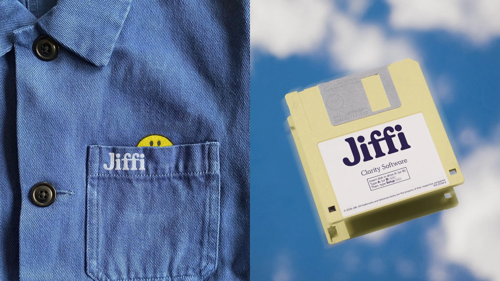
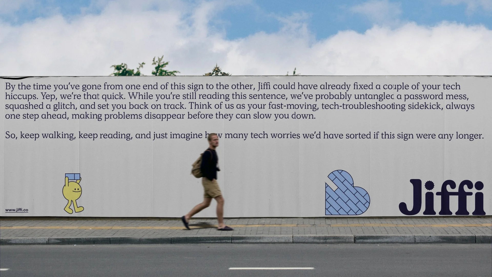
Illustration became the solution to Jiffi’s problems. Unlike words, illustration doesn’t need translation. It’s immediate, instinctive, and universal, something both children and adults can understand without being told what to think.
Inspired by Jiffi’s role as a maker of clarity, the characters explore the interplay between disorder and order through simple, expressive forms. Their limitations introduce humour, and together they turn an abstract idea into something engaging, human and distinctly Jiffi.
Jiffi’s typographic system is built on contrast with intent. A considered pairing of typefaces balances precision with warmth, reinforcing a brand that operates with corporate credibility while remaining human and approachable. It’s technical without being cold, confident without feeling distant.

Colour plays the same dual role. A lighter blue brings energy and openness; a deeper blue anchors the brand in confidence and professionalism. Used together, they create a visual language of clarity - blue-sky thinking made tangible. Accents of bright blue, yellow and white signal moments of insight and optimism, reinforcing Jiffi’s purpose: helping clients move beyond complexity and into clear, confident outcomes.
Some more of our work

Flight Club
Unleash your inner dart-ist

G’Day Parks
Holiday Hacks